Checkout 51
Redesigning the mobile experience to increase conversion rates, decrease user churn, and scale for the future.
Overview
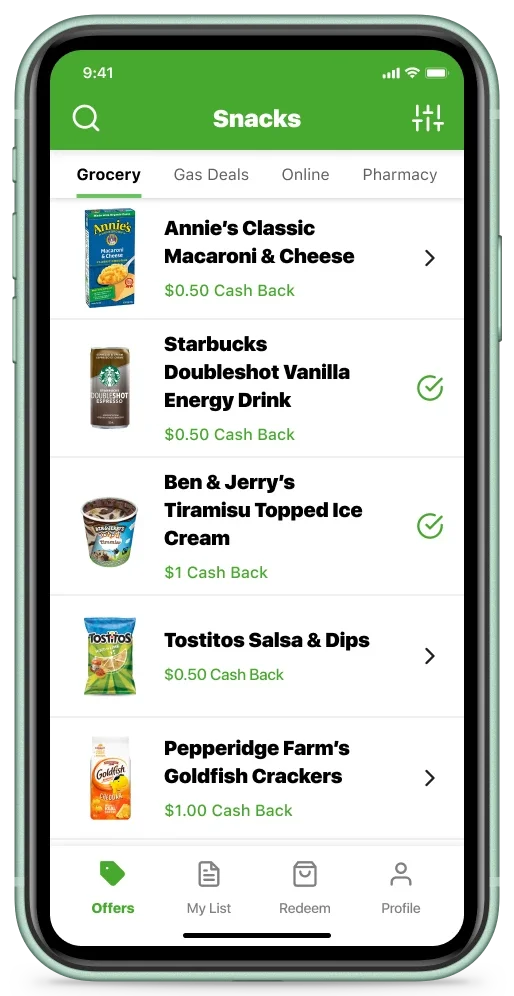
Checkout 51 is a cash-back app that rewards users for grocery shopping, gas purchases, and online shopping. Users can browse and select offers (coupons) within the app and then upload a photo of their receipt to verify the purchases. They earn cash-back rebates after the verification process is approved and have reached at least $20 in saved rebates.
My role
As a solo lead designer, I delivered the end-to-end design process. I collaborated with Product owners, Engineers, QA, Data Analysts, and Customer Success Managers to create a more reliable strategy that was inclusive of design and user-centered thinking. I introduced usability testing, built and tested with functional prototypes, and streamlined the design-to-developer handoff process.
Results
Based on the success of redesigning the global navigation components, the company realized a 10% increase in user redemption, a 5% increase ($60K) in Monthly Recurring Revenue, and an 85% increase in discovery and activations for the new gas offer type.
Business goals
- Increase offer redemptions
Implement product features aimed at boosting monthly recurring revenue.
- Reduce user churn
Enhance user satisfaction to prevent them from switching to competitor apps like iBotta.
- Clean up the UI
Find quick and easy ways to improve the user experience.
Challenges
Enhancing the product development practices
The Product development process followed a traditional waterfall model, with Design playing a supporting role. Product owners often prioritized quick releases, which sometimes compromised the UX, and features that didn't see immediate traction were typically set aside instead of being iterated upon or sunset.
With older apps, my strategy is to identify the main user pain points and uncover correlations that hinder their ability to engage with the core value proposition.
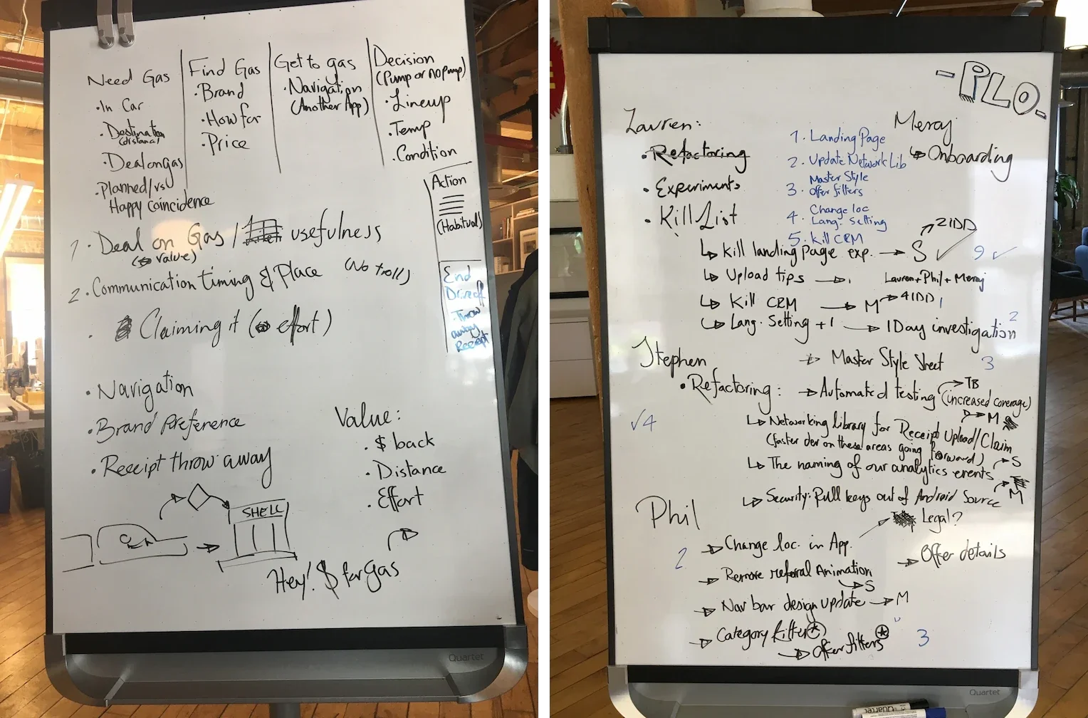
Recognizing the need for a more collaborative and data-driven approach, I worked on gradually gaining buy-in with the four Product owners to change how things were done. By introducing retrospectives, feature prioritization, and group exercises like whiteboard solutioning, I aimed to foster a culture of cross-functional teamwork and continuous improvement.
Discovery
Understanding the value of user feedback
User feedback collected via email, app store reviews, and social media was frequently overlooked and dismissed. This was mainly due to the lack of cross-functional teams to connect the dots between different user touchpoints.
By partnering with the Customer Success and Customer Support teams, I collected valuable insights into the most significant user pain points, which strengthened end-user advocacy and promoted a user-focused culture within the organization.
“I used to really like this app and really want to still like it. Unfortunately they've taken away the any item option, any cash back for fresh fruits and veggies and they have almost no organic option. Everything is processed and super unhealthy.”

“Used to be good. Definitely isn't anymore. There's hardly any offers and any that are decent are all used up within a day or two of being available. Many offers also have a list of specific stores where the items must be bought.”

“Used to be way better, now probably more than half of the offers aren't available to be redeemed, making it hard to get to $20 to cash out very often. If that's the case, remove them. I just got a notification for a rebate that's not even available. It's almost not even worth using in it's current state.”

Design Audit
Evaluating and deconstructing the interface
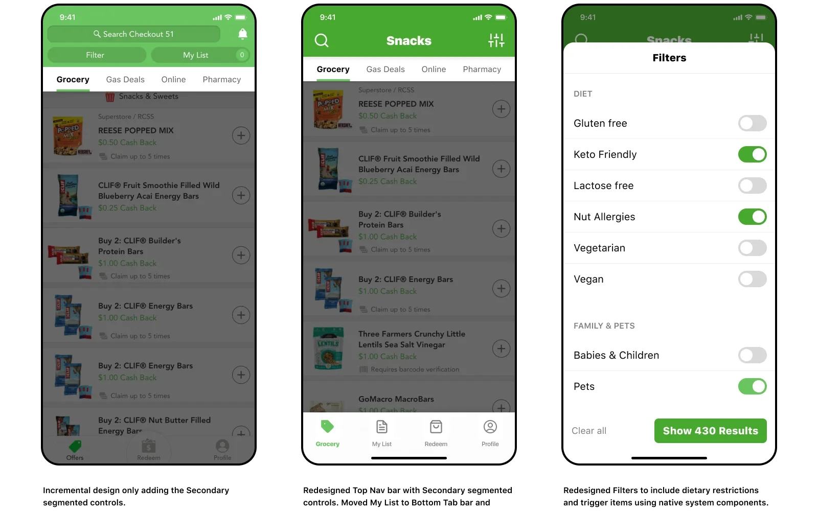
The company's upcoming moonshot projects focused on adding new offer types to the app, but this approach risked worsening existing user complaints. Users frequently mentioned scrolling fatigue, difficulty performing actions, and expressed frustration over seeing irrelevant products—whether dietary incompatible or intended for pets and babies.
On a technical level, the original Top Nav bar suffered from low contrast and small tap targets while the Filter and My List functions were buggy and could not save user settings between sessions. Users also experienced problems searching for products and often lost their place on the list. Resolving these issues was crucial to setting the team up for success with future feature work and addressing the key pain points driving user churn.
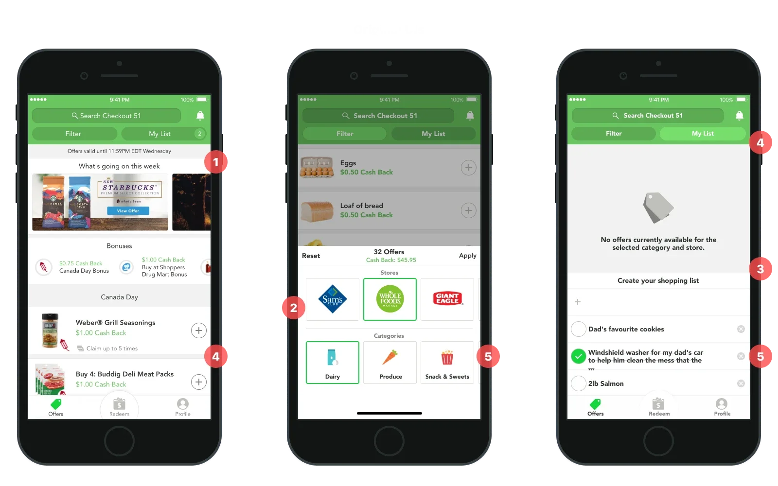
- 1. Unresponsive Design.
- The existing design patterns were rigid and could not scale to meet the current needs of the content or business logic.
- 2. Filtering.
- The filters could only show 3 items at a time and did not persist between sessions. It was difficult to maintain and update because it was a custom component without documentation.
- 3. My List.
- Product owners designed My List to function as a shopping list, but it failed to resonate with users who found its purpose confusing. It missed opportunities to integrate with offers and occupied valuable space.
- 4. WCAG Accessibility.
- The app did not meet WebAIM Accessibility standards. Users often complained that text was too small and UI elements were difficult to see or interact with.
- 5. Technical Debt.
- The accumulation of technical debt often dictated the solutions product owners opted for.
Ideation
Modular design and collaboration with Engineers
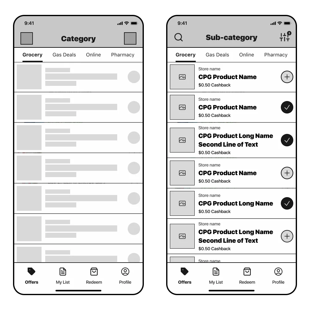
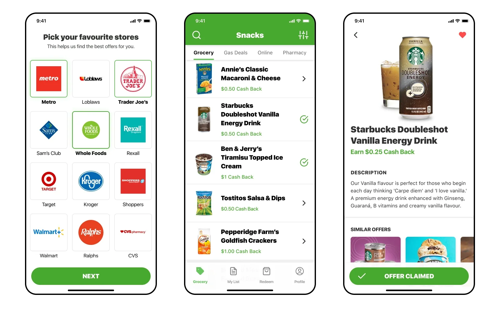
I brought the Mobile Engineers into the solution phase early on. We collaborated and iterated on modular design component ideas using whiteboard sketches and wireframes. Working in a pod team structure allowed us to rapidly prototype and test ideas, and uncover previously unknown technical debt with quicker feedback loops.
This approach allowed us to have a shared understanding of the user experience and technical constraints. We were able to make informed decisions that would scale and be maintainable in the long run.
Design Execution
Visual design and refinement
I approached the redesign with the user's needs at the forefront since a significant percentage suffered from vision loss and reduced motor skills. This was taken into consideration while creating every component, layout, and interaction of the new experience.
Stakeholders were initially reluctant to update the brand colors, viewing the change as unnecessary. Their stance created challenges in advancing the design maturity to meet WCAG Level AA compliance. Despite these hurdles, I remained committed to finding common ground by presenting data-driven arguments and demonstrating the potential positive impact of the updated branding on user engagement, accessibility, and overall brand perception.
Outcome & Results
- increase in monthly user redemptions
- 10%
- increase ($60K) in Monthly Recurring Revenue
- 5%
- Weekly Active Users across North America
- 300K
- increase in user discovery and activations from Tab Navigation
- 85%